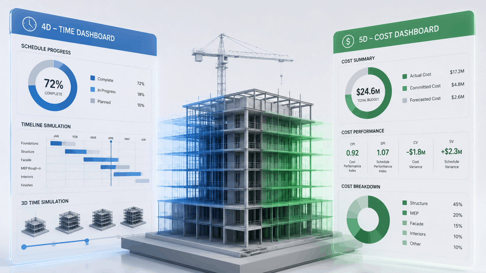
Understand the Role of 4D and 5D BIM in Construction Project Management
The construction industry has long operated with fragmented information. The schedules are in spreadsheets, cost data in separate ERP systems, and 3D models sit in isolation on an engineer’s workstation. Building Information Modeling (BIM) has been steadily dismantling these silos using 3D. But it is the fourth and fifth dimensions of BIM — time and cost — that deliver the most transformative value to project teams today.
This blog uncovers what 4D and 5D BIM mean in practice, what dashboards and metrics each dimension produces, when to use which, and where the technology is heading.
Rethinking the BIM Dimensions
Most people in construction are aware of 3D BIM. It defines geometry, clash detection, and coordinated models. Adding time creates 4D BIM. Adding costs creates 5D BIM. But the difference between them is not merely an additive.
4D BIM
Time-Linked Modelling
The 3D model is linked to the construction schedule. Every element in the model is attached to a task, giving you a simulation of how the project builds over time — visually and analytically.
5D BIM
Cost-Integrated Modelling
The 3D model (and often the 4D schedule) is linked to cost data. Every asset carries a unit of cost, enabling budget tracking, financial forecasting, and real-time cost-performance analysis.
Together, these two dimensions answer the two most critical questions in any project: Are we on time? And are we within budget?
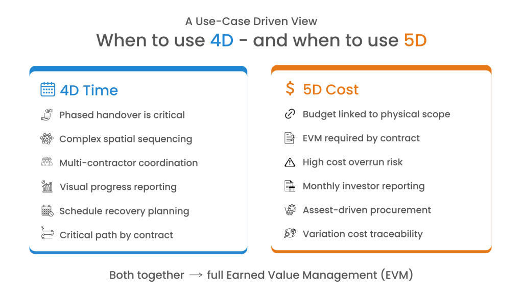
Rethinking the BIM Dimensions
A 4D BIM environment is fundamentally a schedule intelligence layer placed on top of your model. It transforms a static Gantt chart into something far richer — a dynamic simulation where you can see construction progress, predict bottlenecks, and monitor execution against the baseline plan.
Key metrics produced by a 4D BIM dashboard
Total Timeline
Full planned duration from earliest start to latest finish
Passed Timeline
Elapsed time relative to simulation or today's date
Remaining Duration
Time left against the current approved schedule
Execution %
Completed task durations vs planned — the truest progress figure
Beyond key metrics, a mature 4D BIM platform provides richer analytical layers that help project leadership make decisions before delays become crises.
Schedule Chart (Gantt)
Time-phased task hierarchy with durations, dependencies, and predecessors.
Critical Path Map
Highlights the exact chain of dependent tasks that control the project’s finish date. Any delay here is a project delay.
Plan vs Actual S-Curve
Plots of cumulative planned progress against actual progress over time. The gap between these two curves indicates schedule health.
Overdue Task Tracker
Lists tasks beyond their planned finish with delay in days, a risk classification (Low / Medium / High), and recommended corrective action.
Asset Summary
Categorized count of all model assets, giving a high-level scope distribution view aligned to the schedule breakdown.
Asset Distribution
Visual representation of how assets are proportionally distributed across categories.
The S-curve divergence indicates the distance between planned and actual progress lines. It is the single most important early-warning signal in a 4D dashboard. A widening gap in 2-3 months rarely corrects itself by month six without direct intervention.
5D BIM: What It Measures and Why It Matters
5D BIM elevates the model into a financial instrument. Where 4D tells you when work happens, 5D tells you what it costs as it happens. It is a live financial performance layer that connects asset data, procurement activity, and cost curves into a single coherent view.
Key metrics produced by a 5D BIM dashboard
Budget
Approved project budget across all assets and activities.
Utilized Cost
Actual spend based on assets marked as utilized.
Remaining Budget
Available balance after deducting all utilized costs.
Cost Overrun
Expenditure beyond approved budget — zero is the goal.
The combination of category-level cost tables, burn rate charts, and the S-curve gives project finance teams a multidimensional view of financial health.
Asset Category-wise Cost
Tabular breakdown of asset counts per category and their cumulative cost contribution. It is essential for scope-to-cost alignment.
Cost Distribution (Pie)
A percentage-wise cost share of each asset category in the total project budget. It quickly reveals cost concentration risks.
Monthly Cost Burn Rate
Bar chart of monthly expenditure across the project timeline. Spikes in burn rate often signal procurement or sequencing issues.
5D S-Curve
Time-phased comparison of cumulative actual cost vs planned budget. The financial counterpart to the 4D schedule S-curve.
Last 10 Invoices
Recent vendor transactions including invoice amount, date, and payment status to maintain financial auditability
Overall Financial Visibility
The 5D dashboard links cost data to assets, time, and execution progress to have financial control.
5D S-curve is the financial twin of the 4D schedule S-curve. When actual cost runs below planned cost early in the project, it may indicate slower-than-expected progress. Reading both S-curves together is critical for accurate earned value assessment.
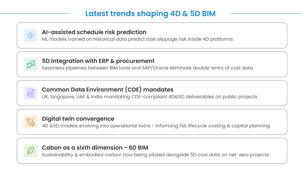
Closing Thoughts
4D and 5D BIM are no longer aspirational technologies for large contractors and public clients. They are becoming standard expectations on any project where schedule risk and cost performance are material concerns.
The distinction is worth restating clearly: 4D tells you where you are in time. 5D tells you where you are in money. Used together, they give project leadership the clearest possible picture of whether a project is truly on track or just on paper.